Really appreciate all the hard work from the Batur team on this. The outcome speaks for itself.

Andrew Prior
Co-founder
Really appreciate all the hard work from the Batur team on this. The outcome speaks for itself.
Andrew Prior
Co-founder
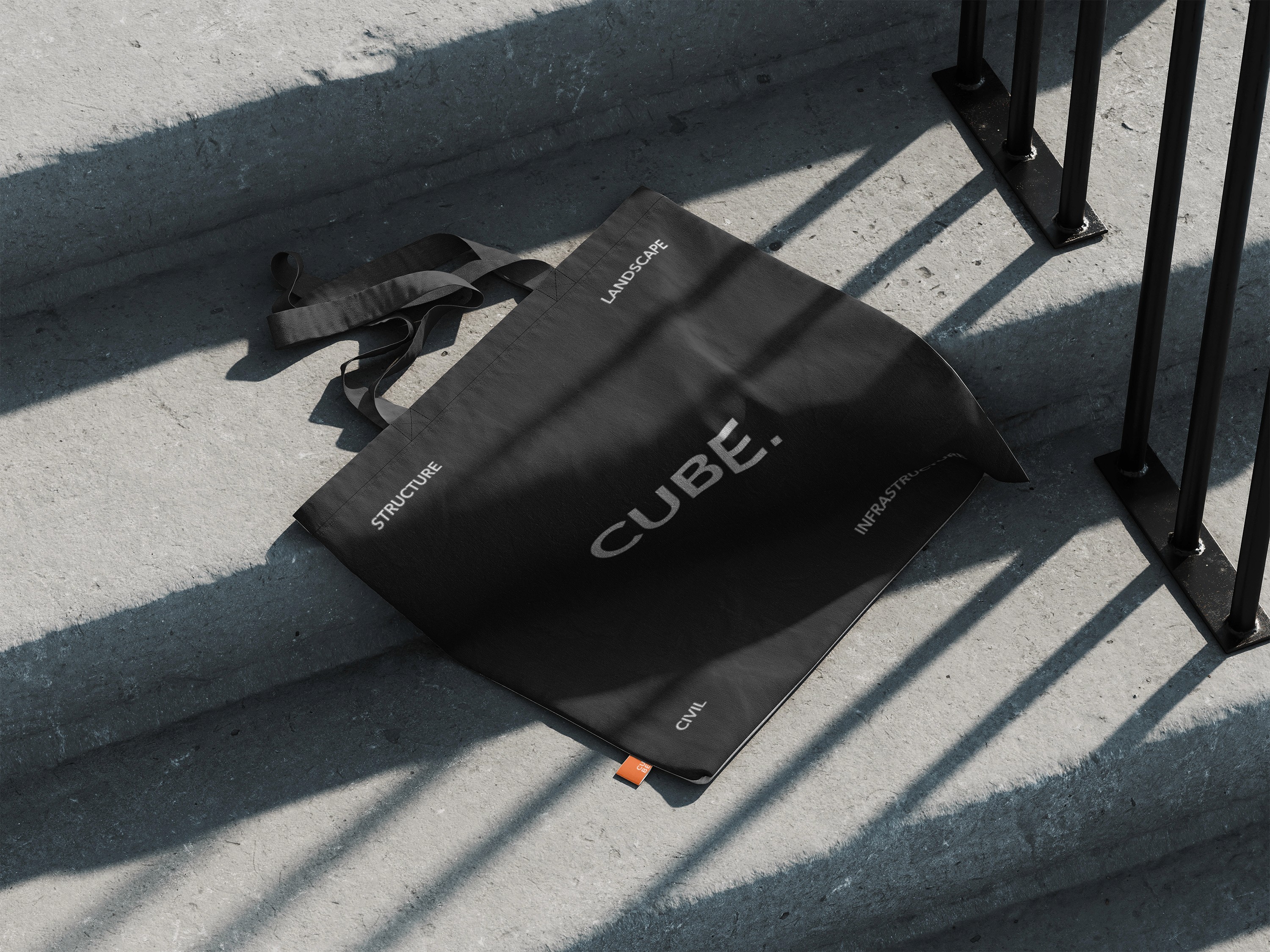
Cube is a progressive engineering consultancy delivering integrated civil, structural, and landscape architecture services across the UK and internationally. Founded in 2020 and built on a culture of precision and integrated design, the business had grown rapidly, expanding its team, service lines, and client base. But the brand hadn't kept pace. Their existing identity lacked the structure and flexibility to be applied consistently across client-facing touchpoints, creating friction as the business scaled. Cube approached Batur to build a brand system that reflected the standard of work they were already delivering.
Cube is a progressive engineering consultancy delivering integrated civil, structural, and landscape architecture services across the UK and internationally. Founded in 2020 and built on a culture of precision and integrated design, the business had grown rapidly, expanding its team, service lines, and client base. But the brand hadn't kept pace. Their existing identity lacked the structure and flexibility to be applied consistently across client-facing touchpoints, creating friction as the business scaled. Cube approached Batur to build a brand system that reflected the standard of work they were already delivering.

Our Approach
We started with what Cube had already built, an established name with real market recognition, and made it the foundation. Rather than a full rebrand, we refined their existing logo into a precise, versatile mark, then developed a full logo suite with variations suited to different applications and contexts.
From there, we built a comprehensive brand system designed to govern every client-facing surface. This included a defined typography hierarchy, a refined colour palette, and a layout grid system that brought the same level of rigour to their visual output as Cube brings to their engineering work. The grid system was applied directly to their proposal decks, sales presentations, and technical reports, ensuring every document they produce carries the same coherence and professionalism, whether it lands in front of an architect, a developer, or a public sector client. The result is a brand system built for scale: flexible enough to work across a growing team, and structured enough to maintain consistency without creative oversight every time.


The Outcome
Cube now has the tools to show up consistently at every stage of the client journey, with a brand that finally matches the standard of the work behind it.
The refined identity retains the recognition they had earned, while the broader system gives the business the infrastructure to grow without losing coherence. From the first proposal to the final report, every touchpoint now reflects the precision and expertise that defines their work, giving the team the confidence to scale without compromising on consistency.

Latest projects
Strategy
Branding
Websites
Silk Road
Building a motorcycle apparrel company from the ground up

Strategy
Branding
Websites
Silk Road
Building a motorcycle apparrel company from the ground up
Strategy
Branding
Websites
ECS Group
Unifying a multi-service infrastructure business under one cohesive brand.

Strategy
Branding
Websites
ECS Group
Unifying a multi-service infrastructure business under one cohesive brand.